BRTM Accounting
BRTM Branding
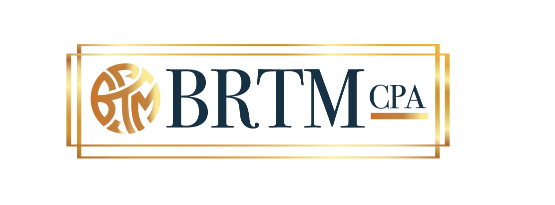
We partnered with BRTM Accounting to develop a complete brand identity from the ground up. The centerpiece of this project was a custom logo design featuring an intricate monogram that weaves the "BRTM" letters into a cohesive circular symbol. This geometric design creates visual interest while maintaining the clean, professional aesthetic essential for a CPA firm.
Challenge:
BRTM Accounting needed a brand identity that would distinguish them in a competitive CPA landscape while conveying the trust and expertise clients expect from their financial advisors. The challenge was to create a logo that felt both established and modern—sophisticated enough to appeal to high-net-worth clients and businesses, yet approachable for individuals seeking personal accounting services. The design needed to communicate precision, reliability, and professionalism while avoiding the generic, outdated aesthetic common in the accounting industry. Additionally, the brand had to work seamlessly across both digital platforms and traditional business materials, from business cards to tax documents.
approach

We began with an in-depth discovery session to understand BRTM's values, target clientele, and competitive positioning within the accounting industry. Our research revealed that successful CPA firms balance traditional credibility with contemporary design sensibility. We explored various monogram concepts, ultimately developing a custom circular symbol that integrates the "BRTM" initials in a way that's both distinctive and timeless. The interlocking letterforms create visual harmony while suggesting the interconnected nature of comprehensive financial services.

Next Project

Bringing Brands to Life

Stay in the Loop

Connect with us on social media to stay updated with our latest projects and insights. Let's network and create together!